

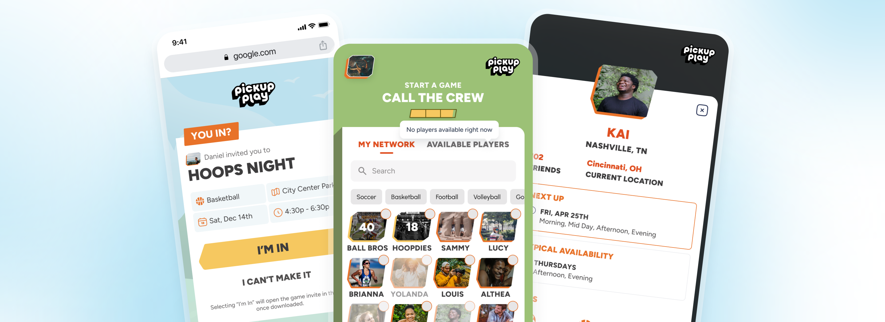
Turning a founder's vision for real-life pickup sports into a polished, game-inspired mobile experience
Services Provided
Mobile App Development, UI/UX Design, Product Strategy
Project Technologies
Flutter | Firebase | AppsFlyer
Industry Served
Sports & Recreation, Startups
Team Composition
1 Mobile Developer, 1 UI/UX Designer, 1 Project Manager
Project Duration
2 years
TLDR
Pickup Play is a mobile app for organizing real-life pickup sports games with the feel of a video game. Twin Sun partnered with the founder from concept through launch, designing and building the iOS and Android app from the ground up in Flutter. The biggest technical challenge was making the invite flow feel effortless: tap a link, install the app, and land directly in a game with no login required. We were upfront about the complexity involved and iterated until the experience was seamless. The result is a clean, intentionally simple app built to scale, with a distinctive aesthetic that sets it apart in the pickup sports space.


The Challenge
The founder had a clear vision for a pickup sports app that would let people organize and join real-life games with the feel of a video game. But translating that vision into a concrete design and working product required more than just coding.
Our Solution
Twin Sun partnered with the founder from the ground up on design, strategy, and development. We designed the app to match the founder’s vision, solved complex technical challenges to deliver frictionless onboarding, and built a polished product with intentional simplicity designed to scale.
The Results
The founder saw his vision come to life in a polished, production-ready app for iOS and Android. The app launched with a streamlined game-creation flow, frictionless guest onboarding via shared links, and a distinctive video game aesthetic that sets it apart in the pickup sports space.

A Video Game Approach to Real-Life Sports
Pickup Play started with a straightforward premise: make it easy to organize and join pickup games of different sports. But the founder had something more specific in mind than a simple scheduling tool. He wanted the app to feel like a video game applied to real-life sports. Creating a game, picking your sport, choosing a location, inviting friends: all of it needed to carry that interactive, engaging energy.
We met in person to walk through his plan and understand the feeling he was after. The first several days were spent entirely in discussion and design iteration, not writing code. He knew how he wanted the app to function and flow, but hadn’t fully defined the visual experience. Our designer started with a lean approach, keeping things simple to stay within budget.
Making the Simple Things Look Simple
The first tangible milestone was the create-a-game flow. We could open the app, create a game, pick the sport, set a location, and invite people. Others could join. We built this on top of guest accounts so we could put something real in front of the client as quickly as possible, without waiting for a full authentication system.
Behind the scenes, the biggest technical challenge was making the invite experience feel effortless. The core requirement was simple to describe: someone taps a shared link, installs the app, and lands directly in the game they were invited to, with no login steps. Making that actually work required combining several technologies and user flows into something that felt like one seamless action.
Staying Close to the Investment
The founder was investing his own money in this product, and we took that seriously. We kept communication more open than usual, with bi-weekly sprint reviews and frequent back-and-forth between meetings. The goal was to mirror his investment with our attentiveness. If he needed to talk through an idea or ask a question, we were available.
The early part of the project had a lot of moving pieces: evolving ideas, shifting design approaches, scope changes. As the project matured, our rhythm became more consistent and predictable. The bi-weekly updates improved over time as both teams developed shared understanding.
Intentional Simplicity Built to Last
The finished product has a deliberate simplicity that serves it well. Screens are clean, navigation is intuitive, and the video game aesthetic makes organizing games genuinely fun. There’s no bloat, no clutter, and no unnecessary complexity.
That simplicity is strategic. The clean architecture and focused feature set mean it can scale without accumulating the kind of technical debt that bogs down products built in a hurry. Features are separated cleanly, screens are easy to navigate, and the codebase is built to extend.


